Phwoar, the tasty flyers have arrived!

Hey Everyone,

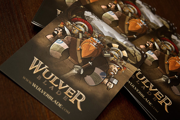
Quick post to show off the killer flyers that just landed, 1000 of the little lovelies! They’re matt laminated onto super thick 400gsm card, so hopefully all you nice folks attending Play Expo this weekend are going to take them home and replace your family photos with them :)

See you all on the weekend!

Mike.


  • Andrew Quick

    Very nice Matey!!!!!!

    • michaelheald

      Thanks Andy, they turned out better than expected which is always nice. No matter how much print work I do, I always feel nervous waiting for the finished article to arrive, just in case I missed something critical lol.

  • Looks awesome Michael. Must be great when you see your artwork printed especially on 400gsm stock. I think you’ve picked some awesome colors too, how do you go about selecting your colors? Is it just playing around or there is a bit more research and theory behind it?

    • michaelheald

      Thanks for the feedback!

      The colour palette has had an exhaustive amount of research actually. I’ve spent countless hours watching, freezing and screen-grabbing movies for the overall theme palette, but my main source believe it or not are the actual locations in the game. I’ve visited every place that appears in the game to date, and at the right time of year (with regards to the seasons) to ensure that the colours match the actual places that they are representing. Its epically time consuming but worth it.

      The proof that this worked well was when I took my sound designers to one of the level locations and without prompt, one of them said ‘ooh, I recognise this place, its just like the game!’. And he went on to detail all the elements that he instantly recognised. Made my day actually ;)

      Another great source for further tonal inspiration is some of the late Frank Frazetta’s work. His choice of palette was ALWAYS inspiring.

      • Hey Michael, sorry for my delay in reply. This response was simply awesome. I love hearing about how you use real life places to create the colour palette. You can see that the hard work pays off in the final design.

        I like the sound of taking a sound designer anywhere let alone to a location that you’ve put into your game! I plan on doing some more study of Frank’s work now that you mentioned it. Great stuff.

  • Anton Xereas

    Nice job! I really like the brown, It makes it look more elegant and professional. Makes me wish I could have gone to the expo! Keep it up ;)

  • Tim McKinstry

    Superb!

  • Oh, I really like this, the theme is awesome and everything else looks so good !! Can’t wait to see the game launched !! Well done !!

    Hope to see more artwork used in the game, characters animations , anything !! :D

    • michaelheald

      Hey Andrej, thanks for the kind words!

      I’m currently looking into screen recording software (with no luck so far, but I shall persist!) that will allow me to post up some WIP videos and tutorials. So fingers crossed I can get that sorted ASAP.

      • Great Michael !! I look forward for more, fingers crossed then !!