So, after my promise of weekly blog posts, I managed only a few, how rubbish ;)
Anyway, to make up for it, here’s a post that people have been asking me to make for years. A breakdown of how I create my characters. Hold on tight, its going to be long winded and drawn out ;)
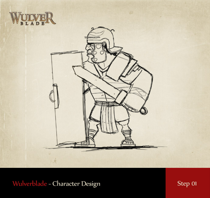
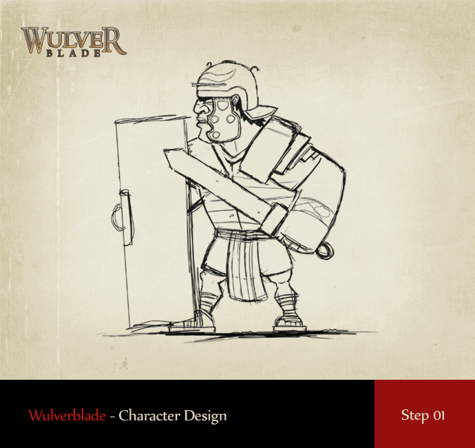
Step 01 – Rough Sketch
I was hesitant to actually show this one as my sketch for the Roman Legionarry is pretty…well…terrible lol. But, this is a process showcase, warts’n’all ;) As I had a clear vision for this character in my head, the sketch could afford to be pretty rough. So I didnt concern myself too much with accuracy and proportions. This was purely about laying down the basics.
One thing I often do is allow my sketches to be very loose, as I work with the intention of making many proportion adjustments once the character is in the vectorising stage. Drawing in vectors allows infinite flexibility as scaling up or down never effects the quality in any way. So, with the sketch roughed out, it was onto the colour.
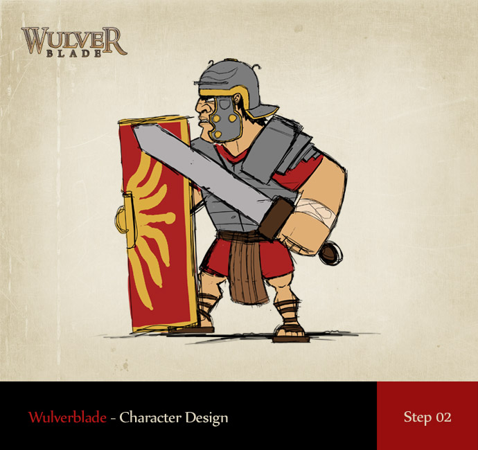
Step 2 – Rough Colour
I like to set a loose colour palette as early as possible as it allows me to clearly visualise where I’m going with the character. Chances are high that these colours will change along the way, but this acts as a starting point. No shading is done here, its just solid blocks of colour.
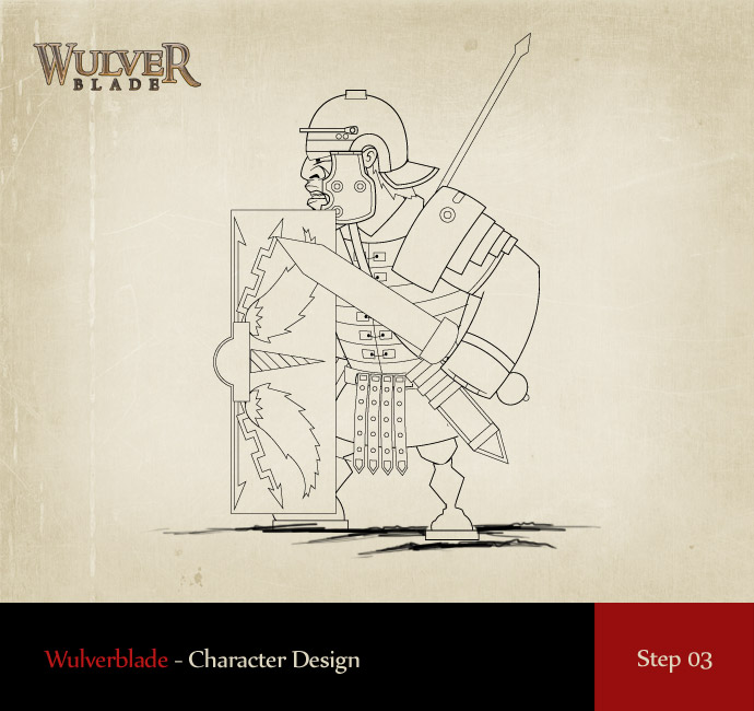
Step 3 – Vectorising the Sketch
Now, most of you will be looking at this and thinking ‘man, this looks awful’ and yes, it certainly does. Even after 15 years of doing this, I still have to tell myself in the early vector stage to ‘stick with it’. Now, with all the basic lines drawn I’m ready for the core of the work, the colour, shading, lighting and detailing.
Before moving on, I’ll just cover what tools I use to draw in vectors. Illustrator is the only vector drawing software I use, I swear by it and I love it. And as far as what tools I use within it…you maybe surprised to hear that I use only two. The Pen tool and the Pathfinder. The pen tool to draw the core shapes, and the Pathfinder to make all my internal shapes. So for example, when I create a shadow on the character, I draw the shape of the shadow, but allow myself to draw outside of the shape (creating excess), using the pathfinder to cut the internal shape out of it like a cookie cutter.
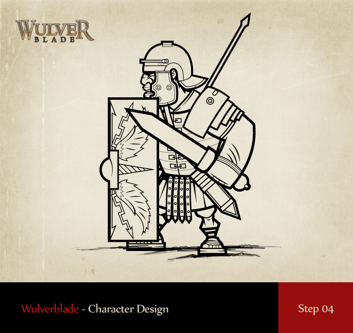
Step 04 – Making the Line Art Meaningful
This is the stage where the line art becomes the character, or at least a version of the character in a state similar to a colouring book ;) You’ll see here that I define the major parts of the character with stronger strokes, allowing the thinner strokes to act as details. So major elements like the torso, shield and sword have thicker outer strokes. These help to not only create the character style, but to draw the viewers eye to the elements I want them to focus on. If everything shared the same stroke weight, the character would be unreadable. Varied stroke weights allow people to instinctively read a character.
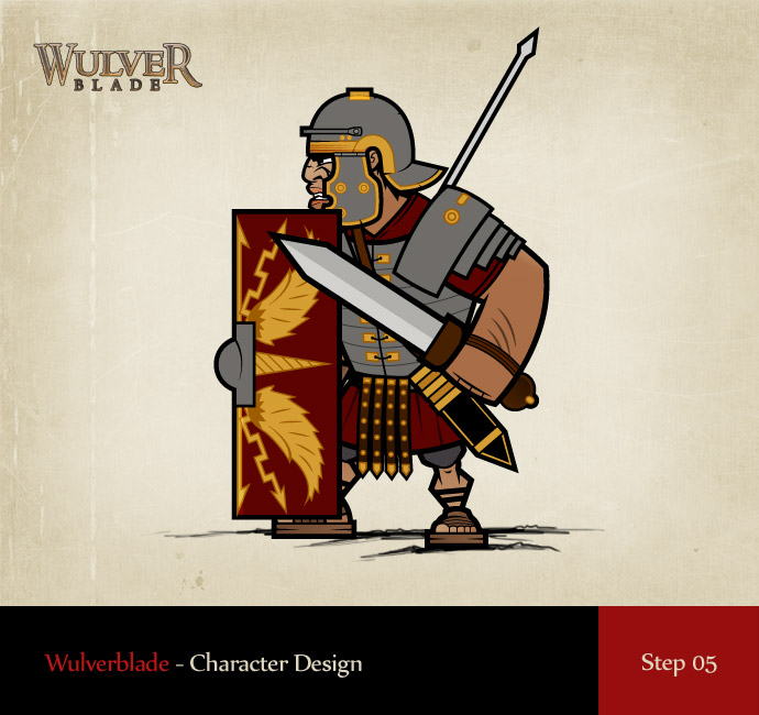
Stage 5 – Base Vector Colour
This stage is a follow on from the initial sketch colouring. I simply lay down my palette, adding each major colour into my palette for easy reference. This is also a great stage to start fiddling with the colours. For speed I use a plugin called Phantasm which is a collection of colour/lighting adjustments that allow easy ways to adjust brightness, contrast, levels, hue, saturation, tints etc. By using these to finely adjust your existing colour scheme you can soon find yourself exploring new directions that you might not have found when adjusting each colour by hand. Phantasm allows you to adjust multiple objects at once which saves having to adjust each element on its own. Making ‘overall’ adjustments is a huge help.
Step 6 – Gradation
This is one my most loved stages and the one that I believe defines my characters from others. I like to add subtle gradation to almost every colour on the character. Sometimes I do it obviously, like on the sword but in many places I add it very, very subtly, almost to a point where you ‘think’ its not there. These subtle gradations of colour allow for much more depth and act as the foundations for the lighting that comes next.
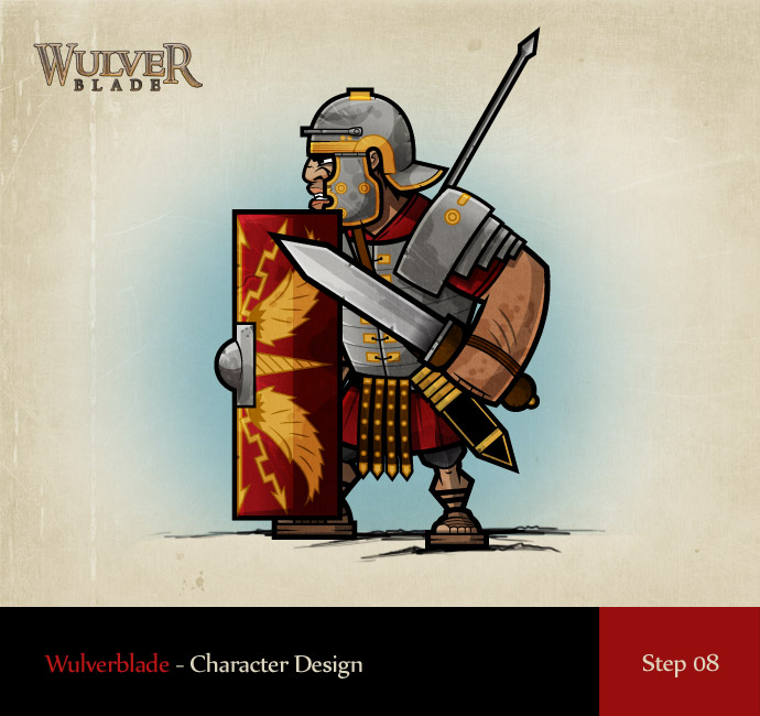
Step 7 – Lighting
Some of you keen eyed folks will notice that I break almost every rule of lighting with my chracters and that is intentional. In many cases, following the rules of light to the letter can often make for a dull character. Bending the rules where it benefits your creation is what makes it special. Some times I’ll move the shadow angle on one part over another, in other places I wont highlight and in many places I’ll add secondary lighthing to help define a feature that would otherwise be lost. Understanding lighting is key, but understanding how to break the rules is what helps to make it individual…or that’s my excuse anyway ;)
As you can see above, if you compare the flat block coloured version to this, you’ll see the power of the subtle gradients and the shadows/highlights. They make or break your character.
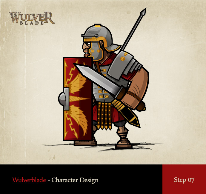
Step 08 – Final Detailing
This is where I like to add in lots of tiny little flares that give the character a story. Adding in chips, dents, dirt etc helps to tell an unwritten story about the characters past. This guy has obviously seen some action and he’s pretty battle hardened. Adding these details and some subtle texture add’s so much overall.
Summary
Well, there you have it, 8 of the core steps that I go through to make my characters. Worth noting too is that I dont always follow my own steps exactly in this stage, sometime I mix up the stages, colouring before finalising my stroke weights etc, I basically go with the flow with every character. I’m not big on sticking to rules.
Here it is in gif form to see the progression from that terrible sketch to the finely polished end Legionary.
I hope this helps any budding illustrators out there as I know you’ve been asking something like this for about 10 years lol. If you have any questions whatsoever, drop them in the comments and I promise to respond ASAP :)
Thanks everyone! My next post will be about environment art as that’s an entirely different beast.
Mike.